70’s look


These are my attempts at making a photoshop action for a 70’s photo effect, please tell me what you think and what i could do to improve it? thanks guys!! the first one has another action added in for cross processing with a yellow tint, which one of my dog is better? 
Well, I kinda like the first one – reminds me of my mother’s photos of us on vacation. Slightly over-saturated, slightly off colors. Nice shot of the dog!
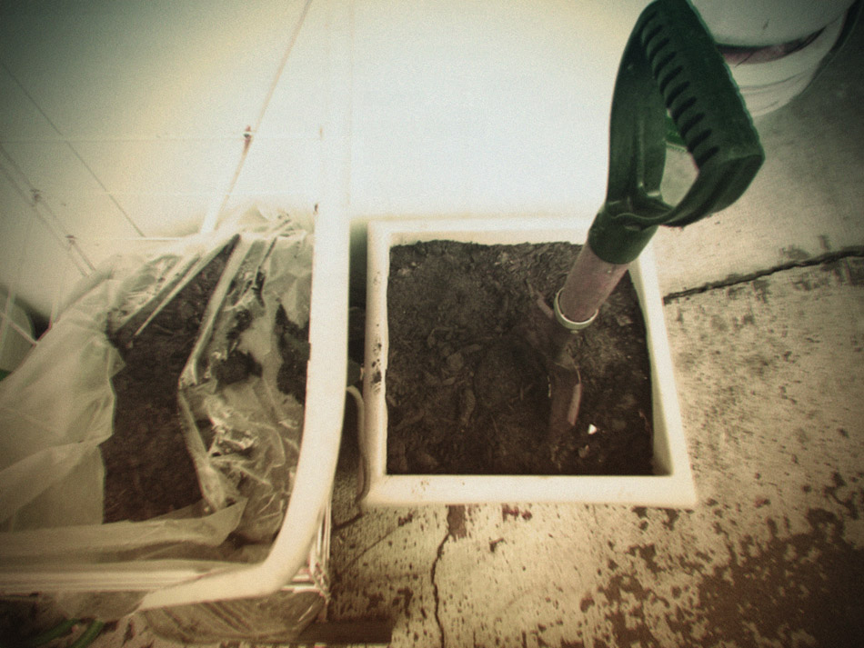
I think I agree with Turnbill on this one, more of a old time feel to that image as opposed to the second one.. then one might ask whats going on here… a dog “gasping” for air then a picture of a shovel and some dirt… hmmm.JK. Nice shot of the dog too though… looks very relaxed.
There’s something about the color of the 1st photo that gives that puppy a 70’s glow…truly…I think after looking back and forth between the two photos several times, I am in agreement with the others. The yellow tint must be what does it! xo
i like the desaturated versions better3 days passed and no change in design, what a drama
can’t really say coz’ they all look pretty effective to me.. she looks like a rock star belting out tunes there.. nice work..
haha i do like the doggie’s expression on the yawning look. seems tired! =]
That first one is definitely the retro look, Elaine. How fun!
I like the first one too, less spooky, lol.
I love it!:-)
wow!! what a set!! faaabulous 70’s style processing!!! i love the yawning dog under the blanket — too precious! xoxox
Needs more orange! I was alive for slightly less than half the 70s and I’m convinced they were pretty orange. But my memory might be faulty.
I really like the processing in the first photo! I think it looks the most “70’s” to me.
Superb. Great capture. Have lovely a day. Antoine.