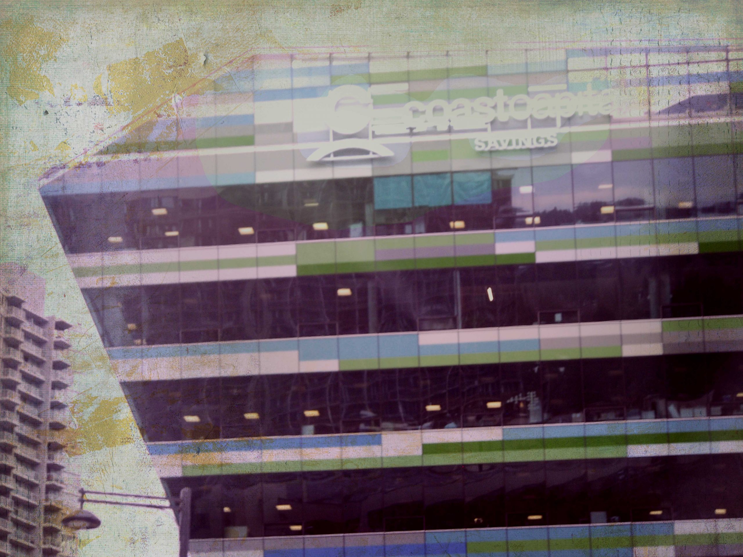
Coast Capital May 27, 2020 Elaine- I have nothing to say about this picture lol it looks like the borg cube of banking has landed and… Resistance is Futile... PREV Remembering NEXT Bridge to Nowhere 11 comments on “Coast Capital” sherri says: May 27, 2020 at 8:36 AM Reply i like it a lot. the grit and color palette really lends itself to the patterns. gotta love the street lamp as well. Loading... Elaine- says: May 27, 2020 at 12:41 PM Reply thanks! looks a bit pukey to me lolol… that street lamp gives a weird kind of perspective doesn’t it? Loading... ruthiebear says: May 27, 2020 at 10:22 AM Reply The blur, the texture and the light all blend to make an interesting mood. Friendship Loading... Elaine- says: May 27, 2020 at 12:40 PM Reply thanks sis… i don’t like the picture, probably why it didn’t inspire a longer post lol Loading... robert quiet photographer says: May 27, 2020 at 1:16 PM Reply hmmmm, not sure what to say…maybe tomorrow…one day… Loading... Elaine- says: May 27, 2020 at 3:20 PM Reply what to say about what? the ugly picture? lol Loading... robert quiet photographer says: May 28, 2020 at 2:52 AM Ugly gives emotions, nice is boredom LOL Loading... Phil Vaughn says: May 27, 2020 at 3:10 PM Reply I found this site https://www.pastemagazine.com/design/look-twice-10-artists-who-specialize-in-optical-illusion/ that lists artists who create optical illusions. Damien Gilley uses angles at, uh, all angles, and your photo has that same flavor. So, instead of 10 artists, maybe you are number 11? Hmmm. Loading... Elaine- says: May 27, 2020 at 3:25 PM Reply wow!!! those pictures are amazing!!! except the poor snake at the end lol and no, i’m not number 11, that picture is just of a crooked building lolol thanks for the thought tho! Loading... Michael Rawluk says: May 27, 2020 at 4:14 PM Reply It looks like all the desks would slide to one side. Loading... Elaine- says: May 27, 2020 at 4:18 PM Reply lol, the floors are ok, it’s my horizon that’s a little off Loading... Leave a Comment Cancel Reply Notify me of new posts by email. Δ
i like it a lot. the grit and color palette really lends itself to the patterns. gotta love the street lamp as well.
thanks! looks a bit pukey to me lolol… that street lamp gives a weird kind of perspective doesn’t it?
The blur, the texture and the light all blend to make an interesting mood. Friendship
thanks sis… i don’t like the picture, probably why it didn’t inspire a longer post lol
hmmmm, not sure what to say…maybe tomorrow…one day…
what to say about what? the ugly picture? lol
Ugly gives emotions, nice is boredom LOL
I found this site
https://www.pastemagazine.com/design/look-twice-10-artists-who-specialize-in-optical-illusion/
that lists artists who create optical illusions. Damien Gilley uses angles at, uh, all angles, and your photo has that same flavor. So, instead of 10 artists, maybe you are number 11? Hmmm.
wow!!! those pictures are amazing!!! except the poor snake at the end lol
and no, i’m not number 11, that picture is just of a crooked building lolol
thanks for the thought tho!
It looks like all the desks would slide to one side.
lol, the floors are ok, it’s my horizon that’s a little off